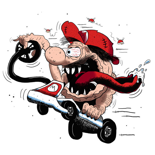
I'll admit that I was suprised when I learned people were drawing things that happened in episodes of The F Plus.
One thing we've learned early on in our journey with this show is that a lot of people listen to it while they're drawing, or doing other visual art. In speaking to artists about it, what I've gathered is that the environment of a collaborative group of people having fun and bouncing jokes of each other is conducive to the specific headspace some artists seek. That's fantastic and I'm delighted we can provide, but either helpfully or hurtfully, there is the matter of the actual content of some of our episodes.
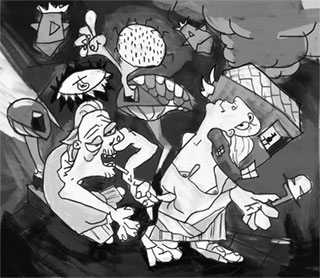
Because as you might know, we (not exclusively, but frequently) explore gross subjects. We've read about a number of oddball fetishes, but there's also a lot of non-fetish proccupations (flashlights) that the mind has to do a lot of work to consider, plus the collateral damage of really specifically awful opinions showing up where you wouldn't expect them, like on the Wizard Forums.
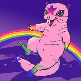
So through all of that, we've explored Waluigi as a sexual-sadistic emperor, human cigarettes with a penis that is also a cigarette, the unicorn juggalo who is a bisexual virgin, space pioneers ejaculating on Mars, naked mole rats drawn by Lisa Frank, and a stoner so big that he's a golem made of Cheetos.
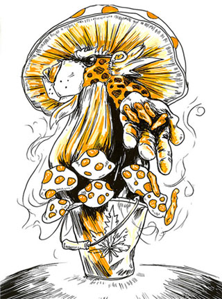
We read about all of these things, at one time or another, and some human being actually took the time to draw it. We didn't expect it (most of the time), we didn't ask for it (almost never), but drawings were made of these and many more scenarios. And I can tell you something - we all really appreciated it. As someone whose own drawing ability is extremely limited (if they all stand with their arms behind their backs then I'll never have to draw a hand), seeing the incredible talent poured into some of these is inspiring, and as a person that's just trying to make a thing other people like - seeing the visual representation of the thing we've put so much effort into - it's really gratifying to see.
So we've had a fanart section to the website for quite a while, but it's always been kind of insufficient. It had a randomness that was slightly interesting but really difficult to explore, and was missing the weight of what really existed. In addition to that, it didn't contain any of the drawings that people have provided over the years for F+ Inktober.
In 2017, Sanguinary Novel had the idea to do an inktober themed around F Plus episodes and so started a ballp.it thread where she identified 31 randomly(?) selected episodes for each day, and set the thing into motion. I built a dumb little website to support the project, and more people participated (and participated for longer) than I would have expected.
2018 rolled around and though the enthusiasm for the idea had shifted some, I renewed the domain and more artists contributed to 31 more prompts. Output was somewhat diminished, but it was still appreciated. But the 2019 prompts saw even fewer responses. And while All The Single Aesir and Don't Be A Hypercrete were (in my opinion) among Spooks and Sauce's best, several factors had led to a diminished interest in Inktober in general, and the website needed to be shut down.
But I was absolutely unwilling to let any of these terrific pieces of art be lost to the sands of time, and so began to fold everything back into the fanart project. Halfway through the process of the move, I realized how inefficiently I had set up fanart before, and thought "I could make this easier on myself!"
Like all web development projects, the "simpler" option required a whole lot of refactoring beforehand, and I spent 27 hours and 14 minutes (according to my Toggl track) getting everything set up for the new system.
But eventually a new system was made, and I'm genuinely proud of it.
Here's the new features, brief as I can describe them:
- The fanart page will show you all fanart currently in the system. Each item is tagged with episode and artist and can be clicked for a larger view. This list will start out randomly ordered, but if you like, you can choose to view by episode or artist, in ascending or descending order. Additionally, there's the ability to filter results only to one of several featured artists.
- Each episode page with fanart will show a section of things drawn related to that particular episode. The site used to do that, but now it does that a whole lot better.
- Additionally, every artist with a page will have their own work featured there as well.
- In all of these cases, clicking on the cropped thumbnail will bring up a modal with a larger view of that image.
- This modal style is then duplicated on several merch pages (such as stickers) where you might want to click something for a larger view.
- While I was at it, the gallery view for merch pages displays a much tighter thumbnail grid than the previous design.
None of these features were something anybody asked for, but just something I felt was appropriate to showcasing something that consistently brings me joy. In the years that we've been doing this show, the art that I've seen, and the things I've been able to do with that art, has been a motivating force to keep working on it. Just to make it clear, another motivating force has been the steady stream of excellent documents you've provided us as well.
I never want to lose sight of the goal: Make dumb things because it's fun to make dumb things. We will hopefully continue to make new episodes, put ourselves through grueling marathons, put on unbelievably rewarding liveshows, showcase wonderfully absurd drawings, and sell even more idiotic merch because all of those things are enjoyable to us. For everyone that's contributed to any of those things: This site update is a thank you for that.
xo,
Lemon
PS: If you're particularly in love with any of these images, maybe reach out to the artist involved inquiring how you could pay them for more?
PPS: The cover image I used here (Mario Ratfink) was drawn by dijon du jour
