This page was updated Jan 1st, 2019.
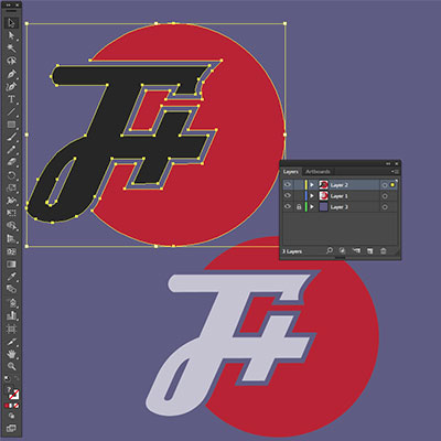
The F Plus' logo was modified on June 26th, 2015 to a simpler and derivative-friendly version of the same shapes we've used since the podcast's inception. On this page you'll find a few use cases, the color palette, some files you can download, and a longer explanation and tips.
SAMPLE USE
COLOR PALETTE
C0282D
192, 40, 45
17, 98, 92, 7
212221
33, 34, 33
72, 65, 65, 73
c6c5d3
198, 197, 211
21, 18, 9, 0
Download .zip file of all logo assets
A BIT MORE INFO
The F Plus logo is made out of two shapes: a simple circle, and the scripty F+ that knocks out the circle. The gap between the F+ and the circle should be transparent (not outlined). The gaps the F+ creates (behind the letter and the middle of the loop) should be left blank.
The usages and colors demoed above and in the assets zip file are all recommended use cases, but are not rigid. If there's deviations to the logo that seem appropriate (such as the pride logo used after the Obergefell v Hodges decision) are perfectly acceptable. We are just trying to provide a guideline.
Any usage of the old (outlined) logo will be phased out over time. Although the logo usage in previous episode images will stay as is, for obvious reasons (in case it's not obvious enough: Nobody really wants to go back and re-do all those Photoshops), but new episode images will use the new logo.
Are you using this logo somewhere? Let us know.
