It was only yesterday that I learned that I learned that The JuggaloCoin (the oft-reported juggalos-only currency developed by Papa Nutt) is no longer with us; The JuggaloCoin is not being traded publicly and perhaps even more tragically, juggalocoin.org just brings up a squatters’ page now.
This discovery led to some related discoveries, which in turn led to this page: a list of all (?) 705 publicly traded cryptocurrencies and their value in relation to the American Dollar. All of these currencies have differences in the underpinning technology that runs them, which doesn’t interest me at all, and many of these currencies have their own websites, which interests me greatly.
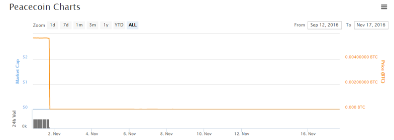
(As a note, I’m going to link directly to all these websites. Some or perhaps all of them are disreputable, proceed with caution.)
So let’s get started.
I took early notice at PotCoin (value: $0.01) which focuses its message on the buying and selling of weed. No clear idea why PotCoin would be better at this than any of the other 704 compumonies on the list, but credit where it’s due, the logo for PotCoin is not a pot leaf. It’s a P with an extra line through it. However, at least once the website forgets where the extra line goes and accidentally uses the symbol for the Ruble instead. Even so, that is a step up from the site for CannabisCoin (value: $0.003), the logo for which is a pot leaf and CANNABIS COIN 420 around the rim. The topnav is pot leafs, the horizontal rules have a pot leaf. There’s a video on the site showing a screencast of the site. It explains the two strains of marijuana and does it incorrectly. It‘s not respectable, until you compare it with GanjaCoin V2 (value: $0.000007) who make the same pitch, use a logo that’s a pot leaf inside a medical cross, and have a website that’s just an nginx start page.
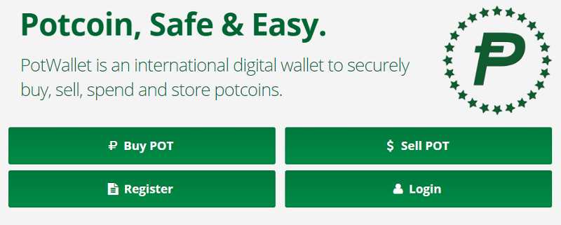
All factors taken into consideration, PotCoin has better design than CannabisCoin, on the merit of comparative subtlety. In turn, CannabisCoin has the better site than GanjaCoin V2, on the merit of it existing.
Now let’s move on to FitCoin (value: $0.000028). The website for this Hong Kong based currency describes it thusly:
We, WiseFinTech, is Pathfinder in FinTech market and shake Finance market with Technology.
Powerful words indeed, but you’ll probably get distracted once the autoplay YouTube video kicks in. Three robots that sing a song explaining how FitCoin works, and I will now quote the entire thing:
Fitco. Fitco. Fitco. Fitco.
Fitcoin. Fitcoin. Fitcoin. Fitcoin.
Cryptocurrency, transactions secured.
Pathfinder for the fintech market.
Finance information technology anytime anywhere around the world.
Resistant to counterfeiting and tampering.
No hacking! No seized accounts!
Fitco! Fitco! Fitco! Fitco!
Fitcoin, fitcoin, fitcoin, fitcoin?
The overall design of the FitCoin website is kind of bland, so let’s compare it against VictoriousCoin (value: $0.000007) which also has autoplay audio, although this time it’s a George Thorogood soundalike that serves no purpose and ends abruptly. This site immediately caught my eye because not only did they use stock images they didn’t pay for, they also left the watermarks and copyright info on the images themselves. This site isn’t WordPress, but taken from a drag & drop site builder called Mobirise using a Bootstrap template. How do I know this? Because this is how they describe the blockchain:
One of Bootstrap 4’s big points is responsiveness and Mobirise makes effective use of this by generating highly responsive website for you.
 This must have been done quickly, because they accidentally link to Mobirise about a dozen times, including twice in the navigation. Several links on the website point to files on mega.nz, the spiritual successor to MegaUpload, which the US Department of Justice indicted in 2012. A concern, but the footer indicates that their address is “Empire State Building”, and if you have any questions, call them at +1 (0) 000 0000 001
While both of these websites are terrible, VictoriousCoin was the one that made me go “Oh shit, I should be using Tor for this.”
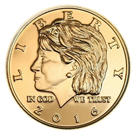 Let’s move on to a currency called Clinton (value:$0.0005) and despite what you might assume, this one didn’t tank in November, it tanked back in May. Using a quarter with Washington’s head replaced with Hillary Clinton’s as their logo, the website for Clinton never directly mentions Hillary Clinton, and there are many words on this site, so they had plenty of opportunity to do so.
Hillary Clinton is also not featured on the website for President Clinton (value: $0.000007), which is a separate currency that also exists, depending on how you define “exists”. The website for that is clickbait not even interesting enough to share here, except I will mention that it’s hosted on the same domain as the other more successful currencies President Trump (value: $0.007) and President Johnson (value: $0.007). There is no President Stein.
Did you know there are two different dogecoins?
The original Dogecoin (value: $0.0002) seems to be a comparative success despite (or perhaps because of) being a joke, but I don't understand how these ImaginationDollars define success. I'm just here for the websites, and this website could be a lot better. I like that they just appropriated the capital eth (Ð) as their symbol (already supported in unicode) but then their coin image is just a gold shiba inu with a bold serif D printed semi-opaque on it. You’ve built your entire identity around a meme with bad grammar and comic sans as established standards, now you’re trying to make a design with some elegance and all I notice is how you use irony as a replacement for trying.
Anyway, DogeCoin is 10,000% more valuable than LiteDoge (value: $0.000002) which no longer has a working website. However, you can buy an official LiteDoge poker chip, and it’ll cost 11,683 DogeCoins. That’s the regular DogeCoins, mind you. They don’t take LiteDoge.
I guess now is a good a time as any to talk about FlutterCoin (value: $0.000081), which I believe is a Brony currency. Their specific use of purple is okay, but should be reversed, as a lilac/amethyst color just doesn’t make an effective accent on white, especially when using a thin weight font. Also, as I click around, I’m noticing this:
The webwallet is loaded with in an iframe and is encrypted.
Even if the wallet is working (which it isn’t), serving an https page through an http iframe is not what “encryption” means. I’m not sure who to blame for this, because of the 18 people on Team FLT, seven are credited as developers, with one person having the job title of “Misc/Web Site” and the instruction “ If the website is broken blame him!!”
However, FlutterCoin is the only cryptocurrency website I’ve seen with a branded Flappy Bird knockoff on their site, so this should be taken into consideration.

The website for PinkCoin (value:$0.00056) implores me to #Donate4Life. I don’t know what that means, and it’s not made clearer by visiting the About page. However, as I read these nonsensical calls to action and battery of hashtags like #PinkArmy, #PinkPower and #ALTruism, I realize this is not meant to inform but the exact opposite.
So if the goal here was just to repackage a scam as a human rights organization, this website is kind of successful in that regard. Kudos, dirtbags!
As “The Original Rare Cryptocurrency”, Unobtanium (value: $1.87) does not take its visual cues from the Avatar movies, which would be comforting if it didn’t take all its cues from Vampire: The Masquerade games instead. Still, this one has a .uno domain so that’s fun.
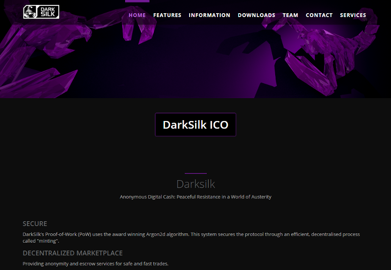
Silk (value: $0.008) is run by The Silk Network, the logo for which is a slight variant of the logo for the darknet marketplace The Silk Road, which the FBI raided in 2013. I question that design choice for several reasons. However, the logos for their products Silk, Dark Silk and Weaver are a phoenix, a scorpion and a furnace filter, respectively. I’ll grant you that a silkworm's lack of visual distinction makes it a difficult choice for iconography, but the fact that they don’t have a spider in the logo for Dark Silk is utterly baffling to me. Beyond that, the site looks okay, Dark Silk’s color scheme is the most flattering. I clearly don’t like nVidia’s branding as much as they do, but they made a decision and went with it.

There’s many, many more websites for the rest of the currencies listed, most of which play in the space between “WordPress Scrolljack Hell” and “Ugly Warcraft Stats Dump”, but I think I’ve done enough research to present the worst cryptocurrency website.
I present to you: Rcoin.

It’s a Russian website, so you can get a poor translation via Google Translate (like I am) but there’s a lot going on visually. It starts out with two quotes, and using a quote from Bill Gates talking about how important the internet is to your business is like using a quote by Steve Jobs about how alternative medicine might ultimately kill you faster.

But it’s the clipart employed by this site that really captures my heart. An unlabeled 3D pie graph that’s labeled “deposit rate”. Happy businesspeople cheering behind an Eric Trump lookalike. Other businesspeople all giving thumbs up except for the guy in the middle who needs to have it explained to him what the word “up” means. More unlabeled charts, one of which has two businesspeople doing the complicated “shake hands but also play tug of war with an unprinted business card at the same time” game. A round of Porrasturvat played on top of American dollar bills. The four people who hide behind Janice. Every piece of imagery this site uses is amazing, and most of it moves.

There’s even a section with fake numbers! A section just above Janice and her minions says “Mined currency” with a large number underneath it. That seemed weird to me, so I dug into the code and sure enough there’s a snippet of code that generates a number based on the browser’s date stamp. I apologize for upsetting your innovative currency, but I just created -74 billion Rcoins by changing my computer’s date to 1986.

They didn’t think that far ahead with the Registered users number, which actually tries to pull a number from a broken API and display it to the user. This is a very weird decision to me: You have absolutely no problems inventing a value to your currency out of whole cloth, but you want to make sure you don’t lie abut how many members your forum has? Regardless, I understand why the “Our principles” section is blank.

However, as long as I’ve shown you the worst site I’ve seen, I should also show you the best. This is the website for Flaxscript (value: $0.00007) I don’t understand this website any more or less than the other websites I’ve seen today, but this time I actually want to know more. All I know is it was created by The John Dillinger Died For You Society, and their logo is this:
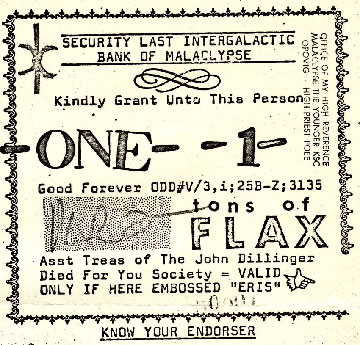
When designers tell clients they want to "encourage curiosity", this is what they should aspire to.
